8 Speed Display Fonts for Racing, Automotive, and Futuristic Designs In the world of racing, gaming, and futuristic design, typography plays a huge role in creating energy and visual impact. The right display font can instantly make your design feel faster, bolder, and more professional. Whether you are working on automotive branding, esports graphics, YouTube …
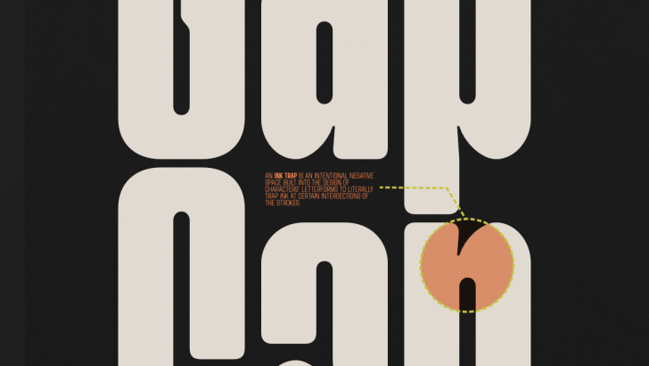
Ink trap
Ink trap is a typographic design technique that was originally created for technical purposes rather than aesthetics. The term refers to small notches or cut-ins placed at the inner corners of letterforms, typically where strokes meet, such as in the letters “n,” “m,” or “a.” At larger sizes, ink traps appear as visible cuts, but …
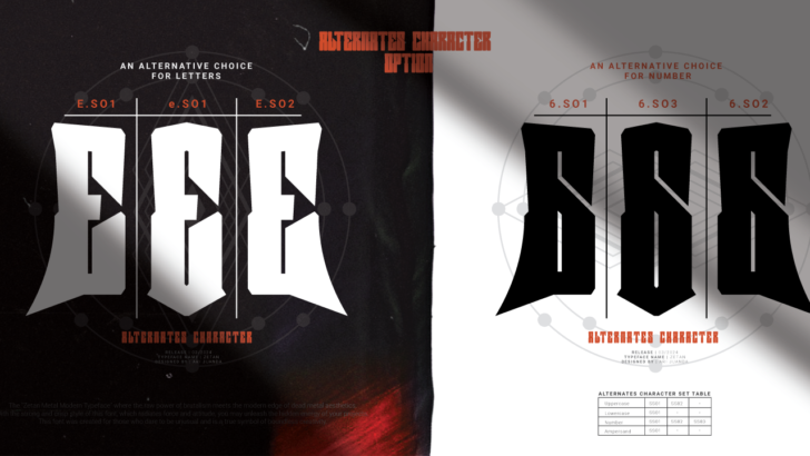
Exploring Fonts with Alternate Characters: Flexibility in Typography
Fonts with alternate characters are typefaces that provide multiple variations for the same letter. This means a single character, such as “a” or “g,” can have different design versions within one font. This feature is commonly found in modern fonts, especially those created for creative purposes like branding, logotypes, and display design. The presence of …
Surge a typeface
The Surge font delivers a strong, bold, and modern visual character through its highly condensed display style. With tall, compact, and slightly aggressive letterforms, it instantly grabs attention and works perfectly for headlines, posters, branding, and any visual project that aims to stand out. Each character is crafted with precise proportions, creating a solid yet …
