Description
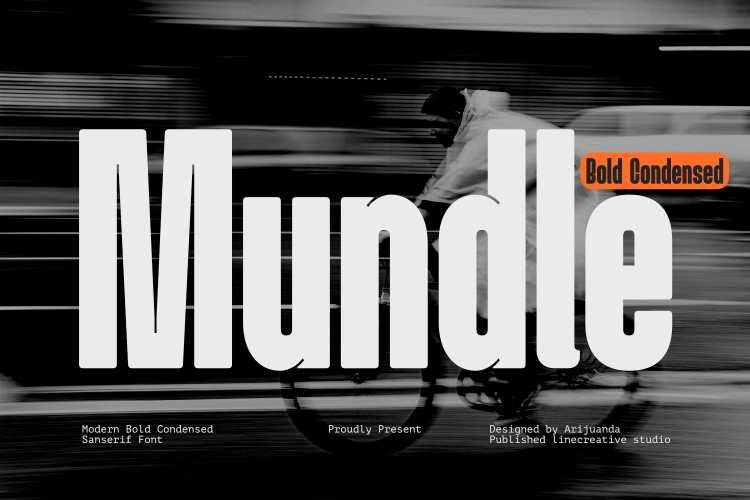
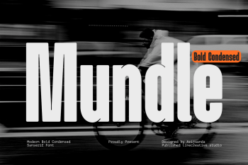
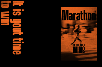
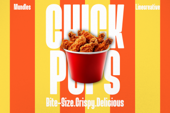
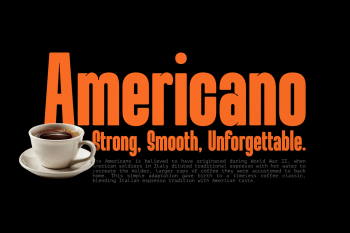
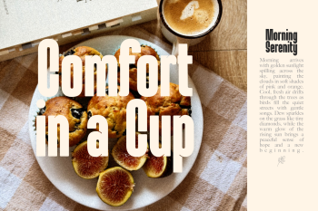
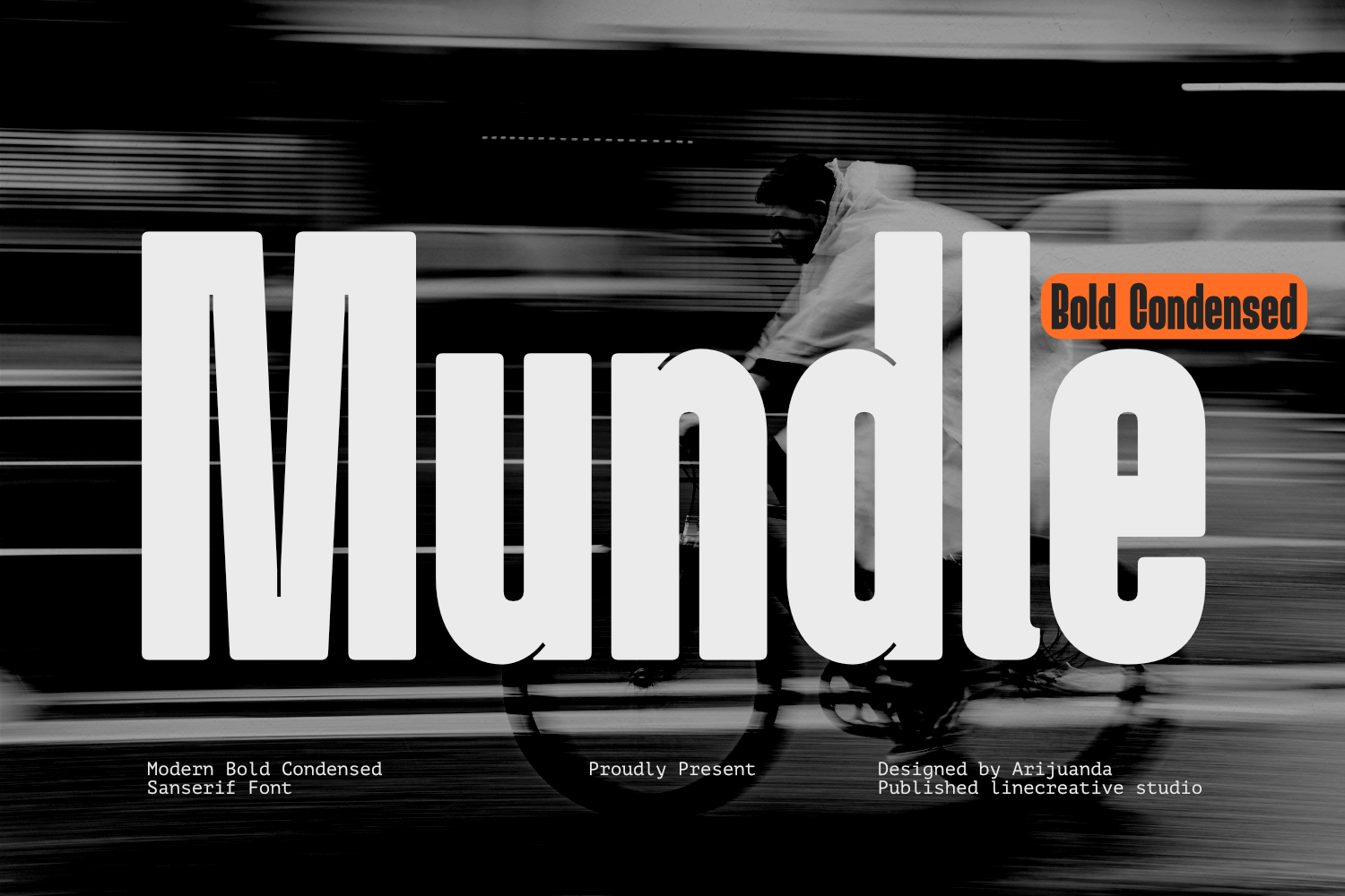
Mundle Bold Condensed Display Font is a bold condensed display typeface designed by Ari juanda that combines visual strength with a modern character. Designed specifically for large-scale applications, Mundle Bold Condensed Display Font serves as a typographic solution that is assertive, efficient, and full of clear identity. This font was not created as a text typeface intended for long paragraphs, but as a display typeface capable of speaking loudly through headlines, titles, posters, branding, and various other visual applications.
Key Features of Mundle Bold Condensed Display Font
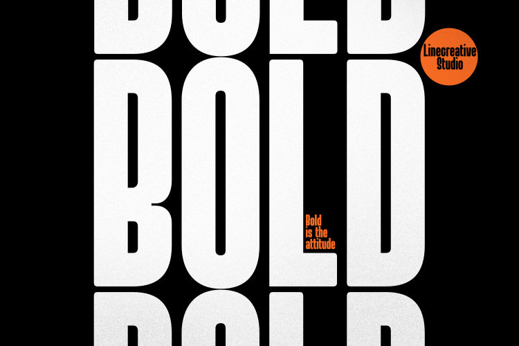
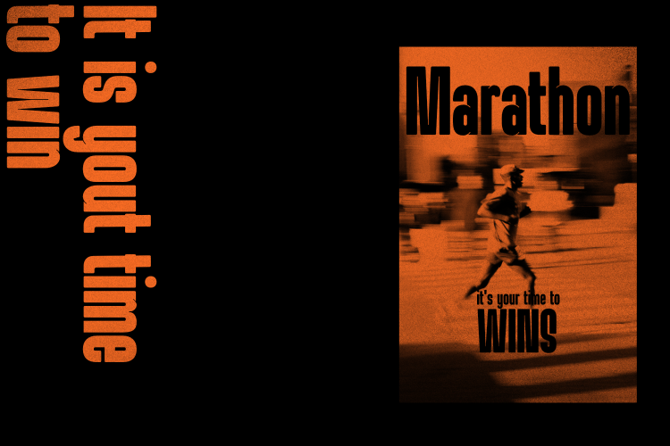
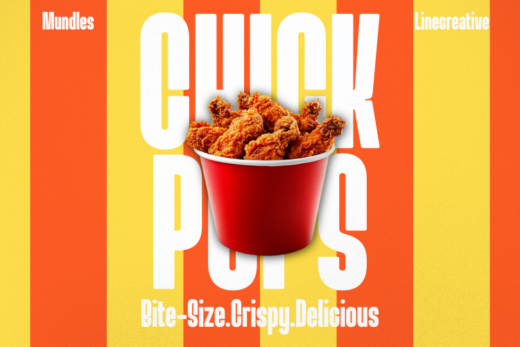
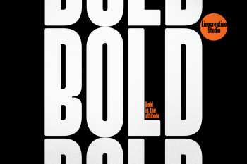
In terms of construction, Mundle Bold Condensed Display Font is built on strong condensed proportions. Its compact forms allow for efficient use of space without sacrificing visual presence. The bold stroke weight delivers maximum impact, while the condensed structure makes every letter feel solid and full of energy. This combination makes Mundle highly effective at large sizes, where every detail of the letterform can be clearly seen and leaves a strong impression on the audience.
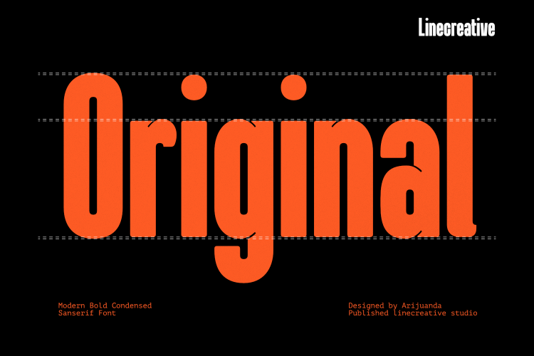
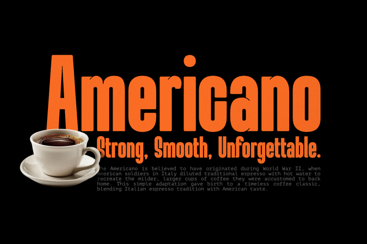
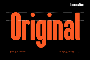
One of the main distinctive features of this Mundle Bold Condensed Display Font lies in its rounded terminals. The ends of the letters are gently rounded, introducing a subtle softness within an overall assertive and masculine character. This rounded treatment prevents the typeface from appearing too rigid or aggressive, while at the same time adding a contemporary feel that aligns with current design sensibilities. The rounding in Mundle is not excessive; it acts as a balancing element rather than a dominant feature that would weaken the strength of the basic forms.
On the other hand, Mundle Bold Condensed Display Font is also equipped with ink traps. This element becomes a marker of the typeface’s technical and modern character. Ink traps are selectively placed at join corners and areas that are prone to appearing too dark, especially in letters with multiple stroke intersections. The presence of ink traps not only serves an optical function but also strengthens the visual identity of the font. At large sizes, the ink traps become an interesting detail that gives a more “designed” impression, distinguishing Mundle from many other plain bold condensed typefaces.
Versatile Applications for Mundle Bold Condensed Display Font
Mundle Bold Condensed Display Font is available as a single style. It is not a font family with multiple weights, widths, or italics, nor is it a variable font. This decision was made to keep the focus on one strong and consistent visual character. Additionally, Mundle Bold Condensed Display Font does not include ligatures or alternates. This approach was deliberately chosen so that users can apply the font directly without unnecessary complexity, while still maintaining the simplicity and sharpness of its core character.
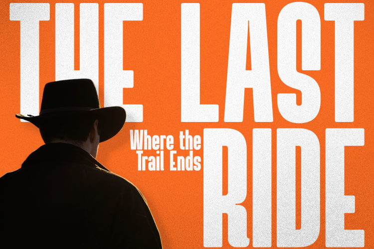
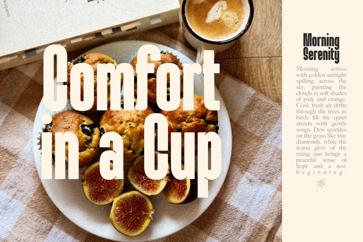
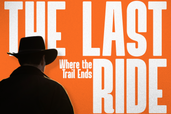
Functionally, Mundle Bold Condensed Display Font is highly suitable for a wide range of display needs. It performs well in editorial titles, event posters, magazine covers, branding materials, logo wordmarks, social media content, motion graphic titles, and other large-scale visual applications. Its main strength lies in its ability to create clear visual hierarchy and provide strong focus on the primary message. When used appropriately, Mundle Bold Condensed Display Font can become the center of attention without having to compete with other design elements.
Readability and Best Usage Practices for Mundle Bold Condensed Display Font
Although it has a strong character, Mundle Bold Condensed Display Font still maintains readability at display sizes. Letter proportions, spacing, and optical balance have been carefully considered so that it remains comfortable to view in headline and title contexts. However, it should be noted that this font is not recommended for long body text. Its condensed and bold nature makes it less ideal for extended paragraphs, where reading comfort is the main priority.
Overall, Mundle Bold Condensed Display Font is a typeface born from the need for a display font that is not only visually powerful but also has a recognizable character. Designed by Ari juanda, the combination of bold condensed structure, rounded terminals, and ink traps creates an identity that is modern, assertive, and slightly technical. This font is intended for designers who need typography with high impact, space efficiency, and a clear personality to support their visual communication.
Similar Fonts



Reviews
There are no reviews yet.